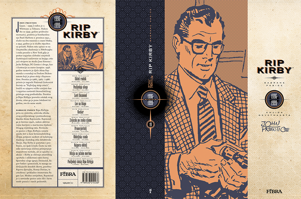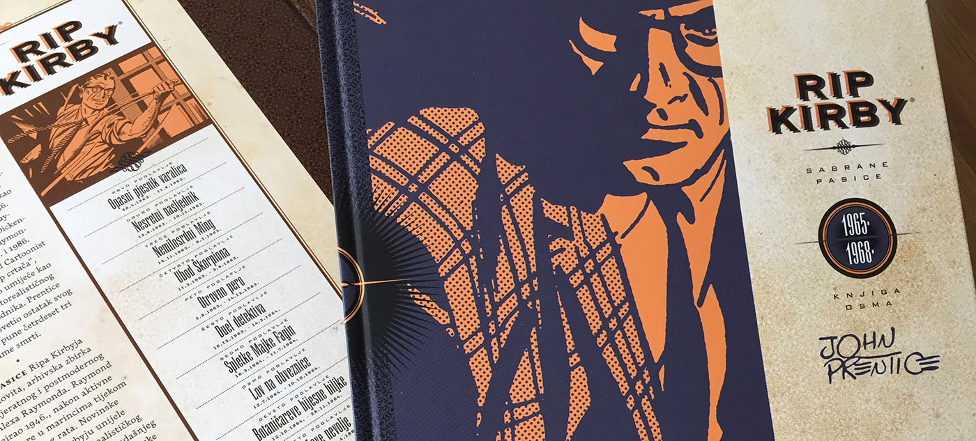

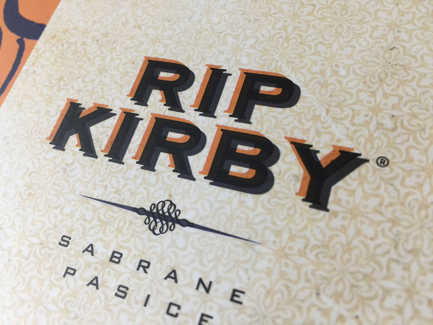
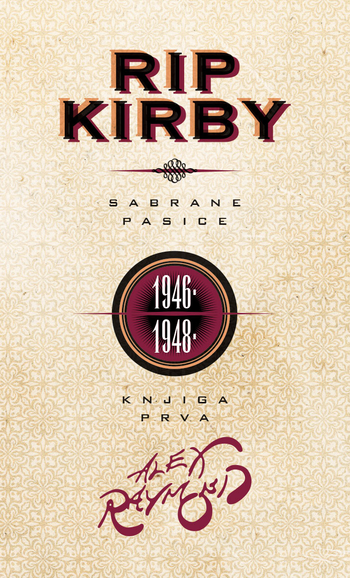
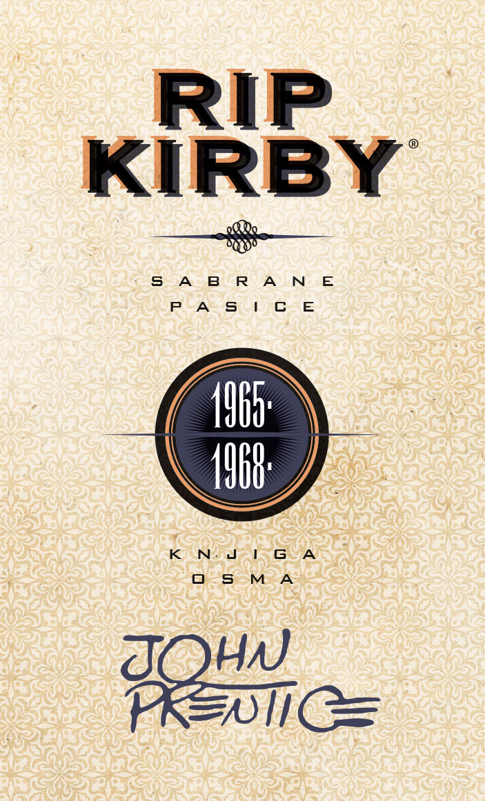
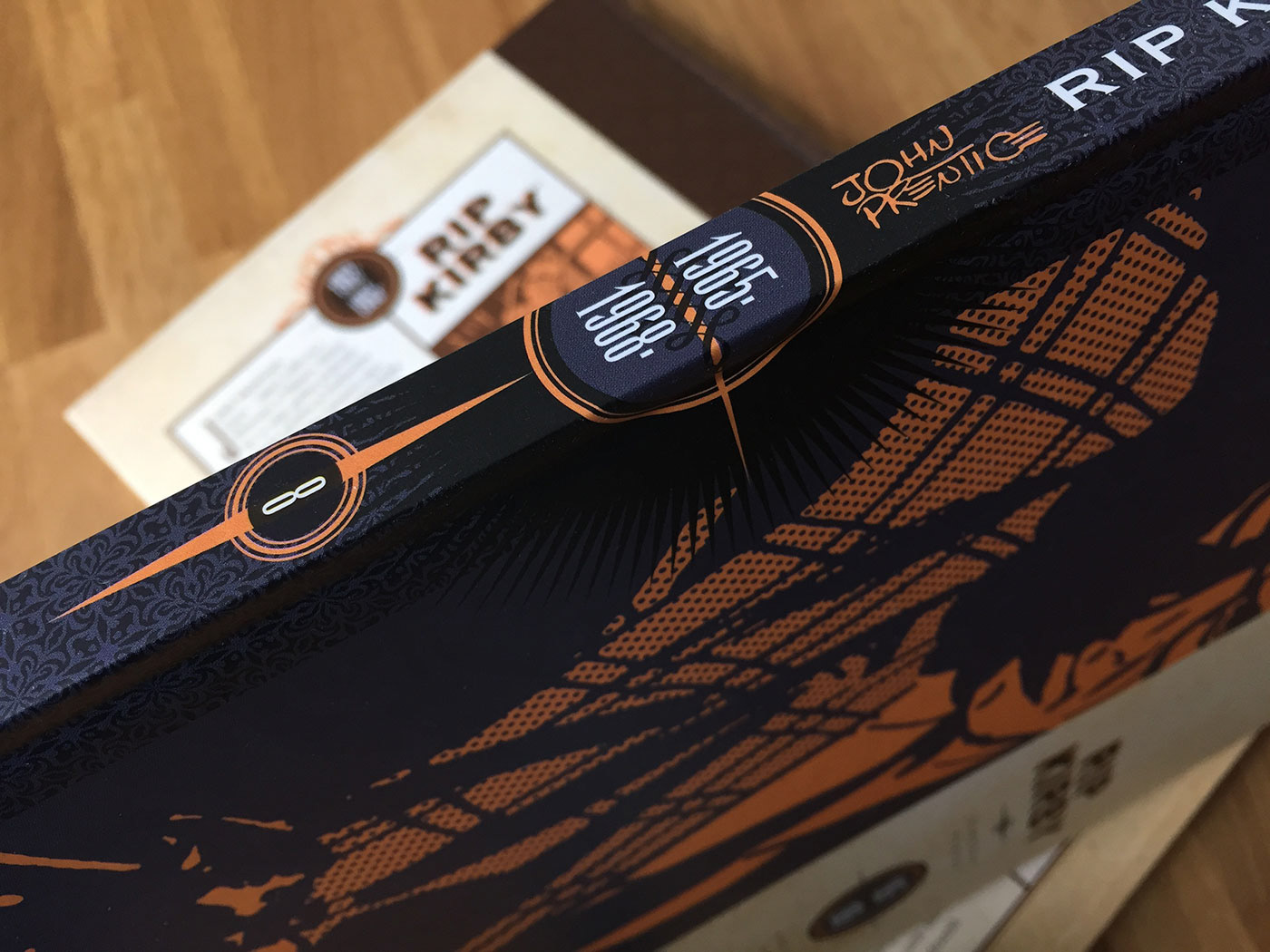
Since the first Rip Kirby strip was created and published in American newspapers in 1946, I wanted this book series to have American retro design while giving credit to the old printing techniques which I love so much.
So I chose to use Copperplate with Bank Gothic as typography and intentionally have overprinting colours for the main logo. The background is a custom-made ornament texture merged with old paper, to achieve wanted look & feel.
So I chose to use Copperplate with Bank Gothic as typography and intentionally have overprinting colours for the main logo. The background is a custom-made ornament texture merged with old paper, to achieve wanted look & feel.
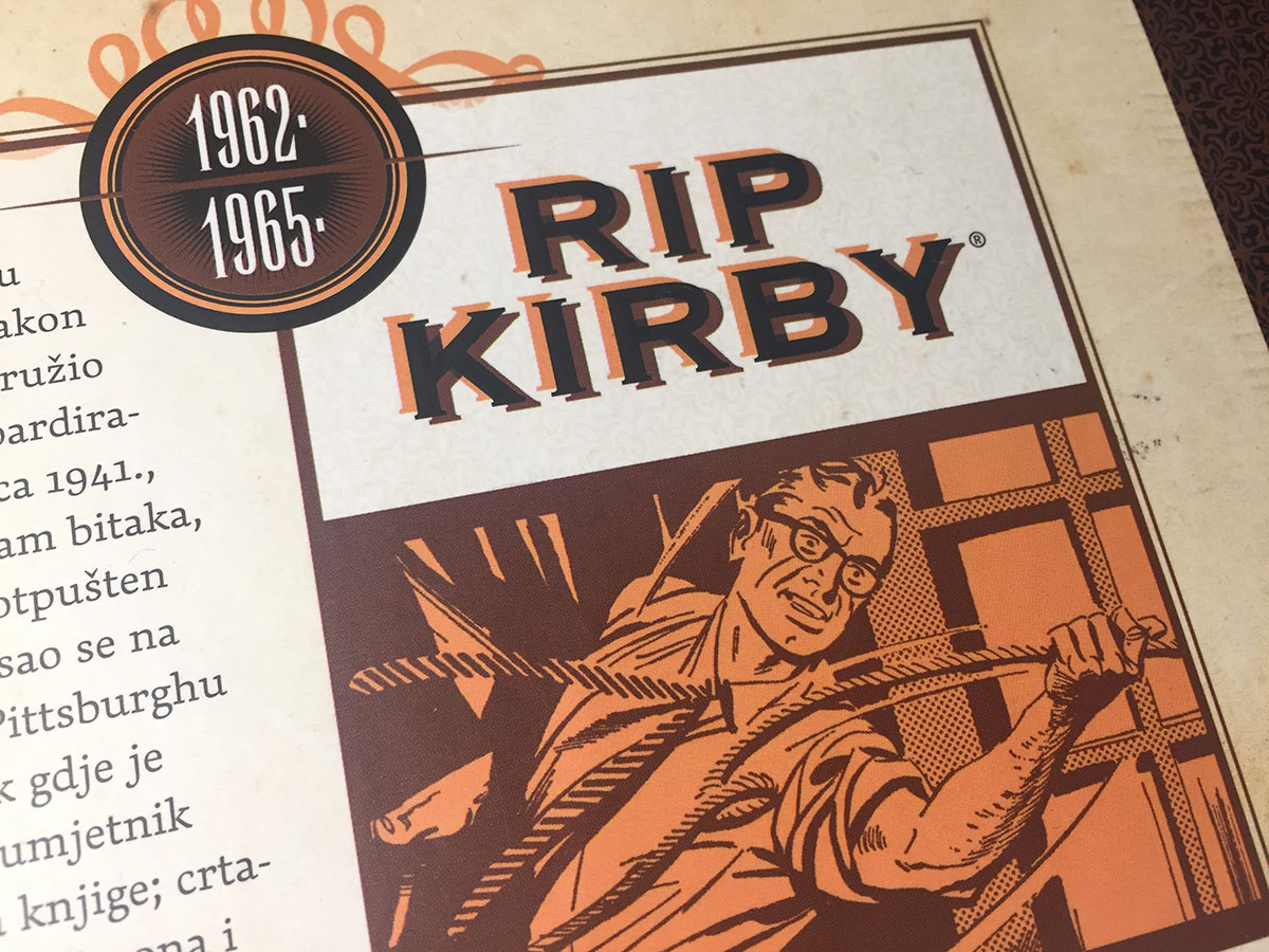
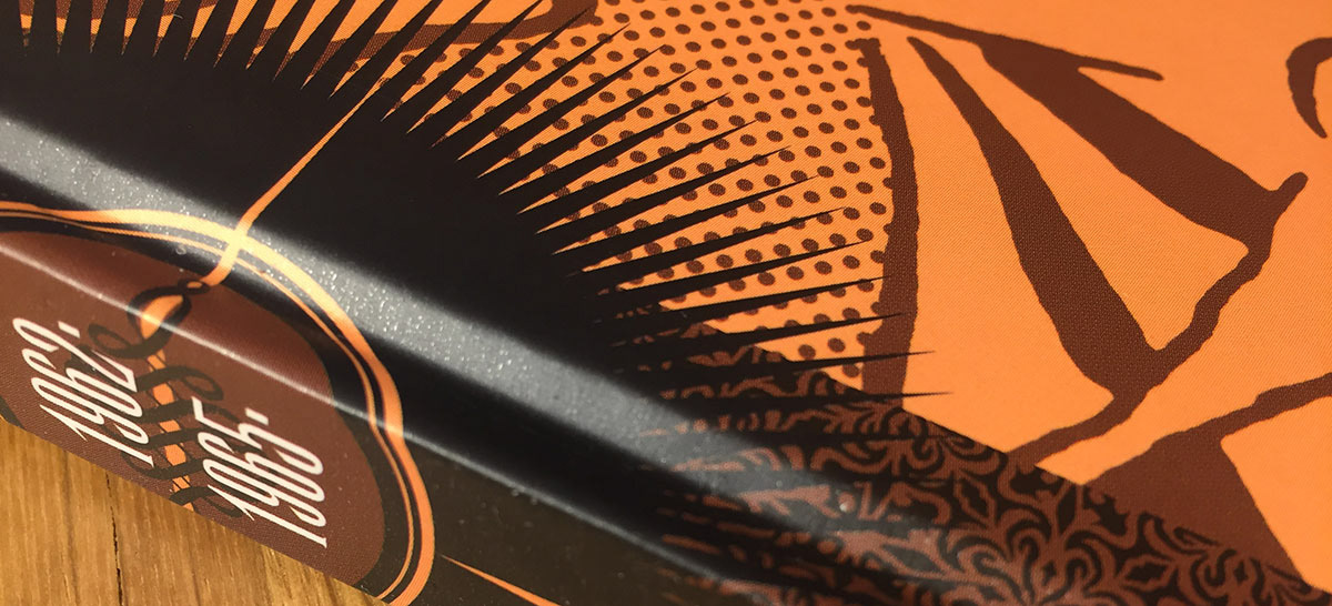
In those old times, they used Ben-Day dots as a printing technique to better separate planes in the panel. You can see them on the left photo below, used for the window behind Rip Kirby. The main Rip Kirby figure on the front cover is chosen from the book from the same period and combined with Ben-Day dots to keep the authentic look.
When you look at the covers, you should see how the character has been changing throughout the years.
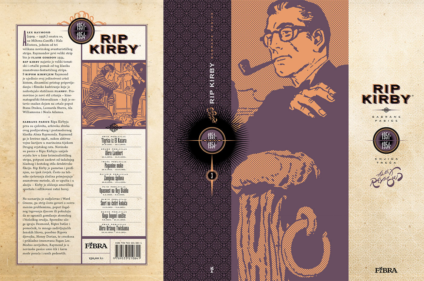
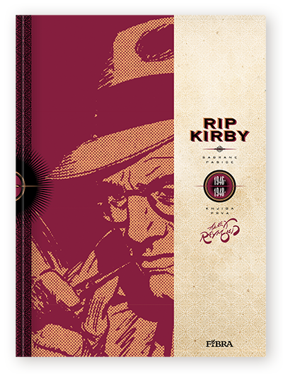
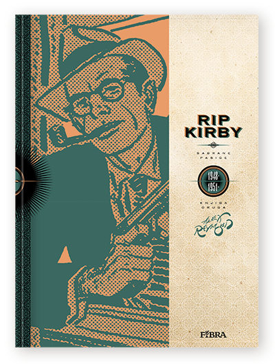
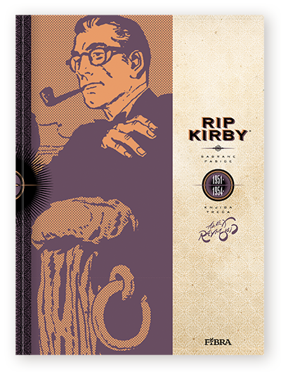
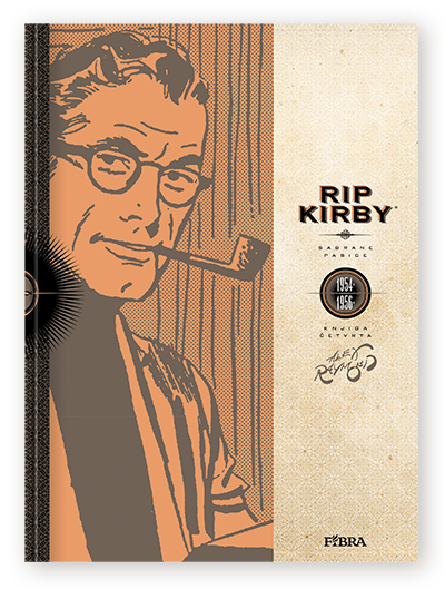
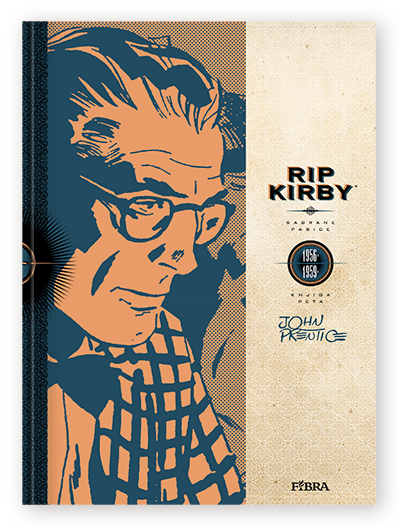
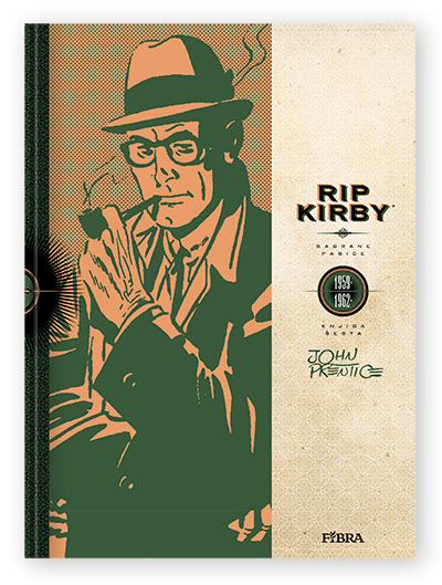
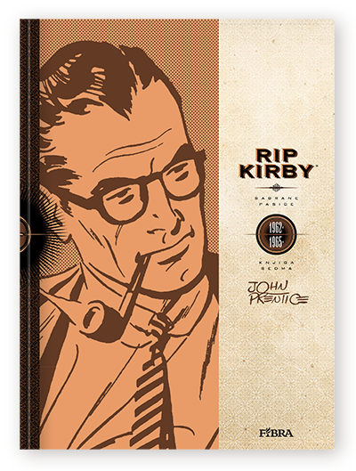
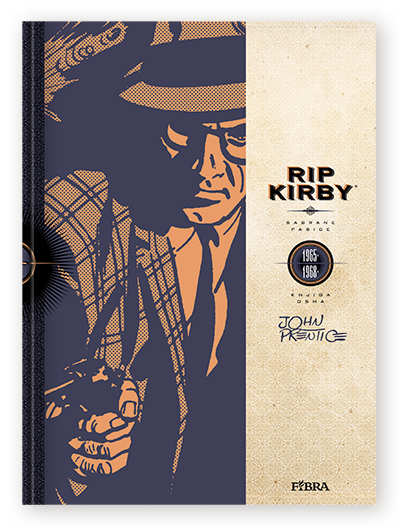
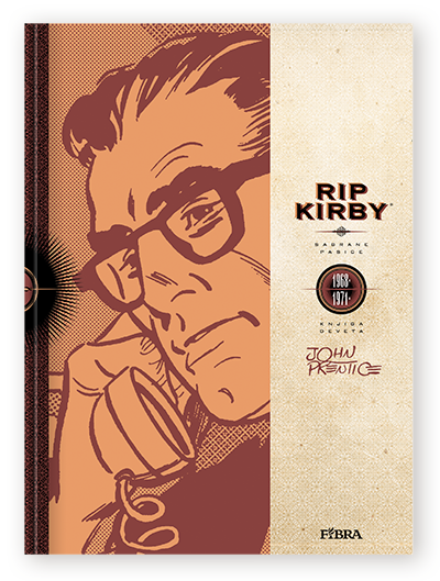
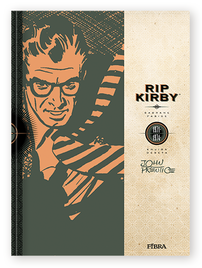
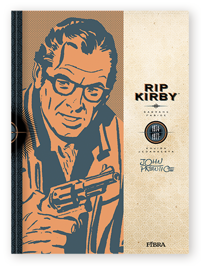
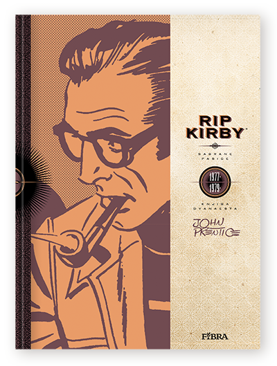
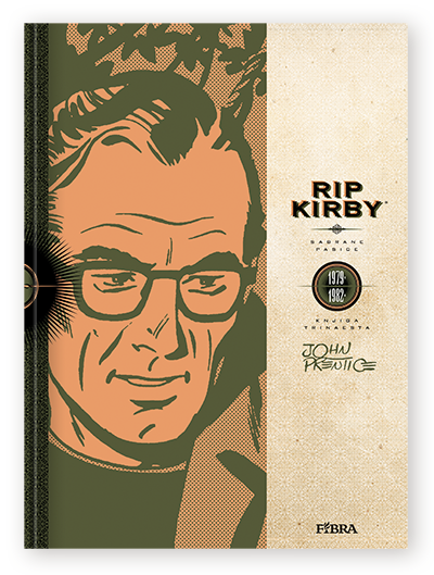
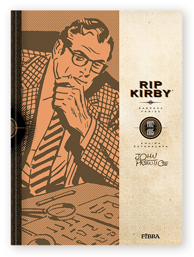
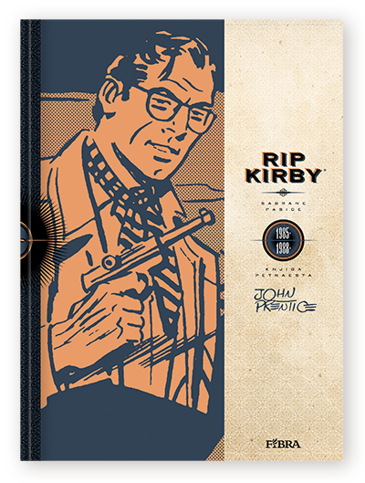
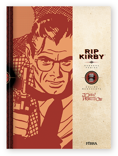

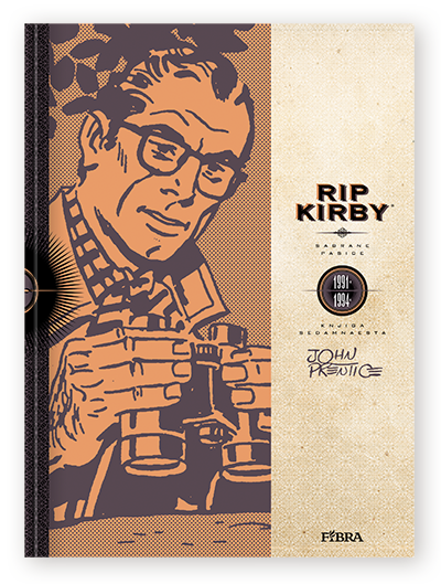
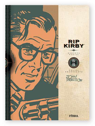
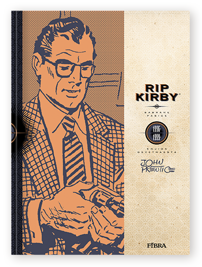

The whole series is coloured with desaturated orange which, along with the textured old paper, sets the base look. Each book has a different main colour. Colours used on series were taken from the 1950s period, i.e. the way clothing looked in Hitchcock's coloured movies.
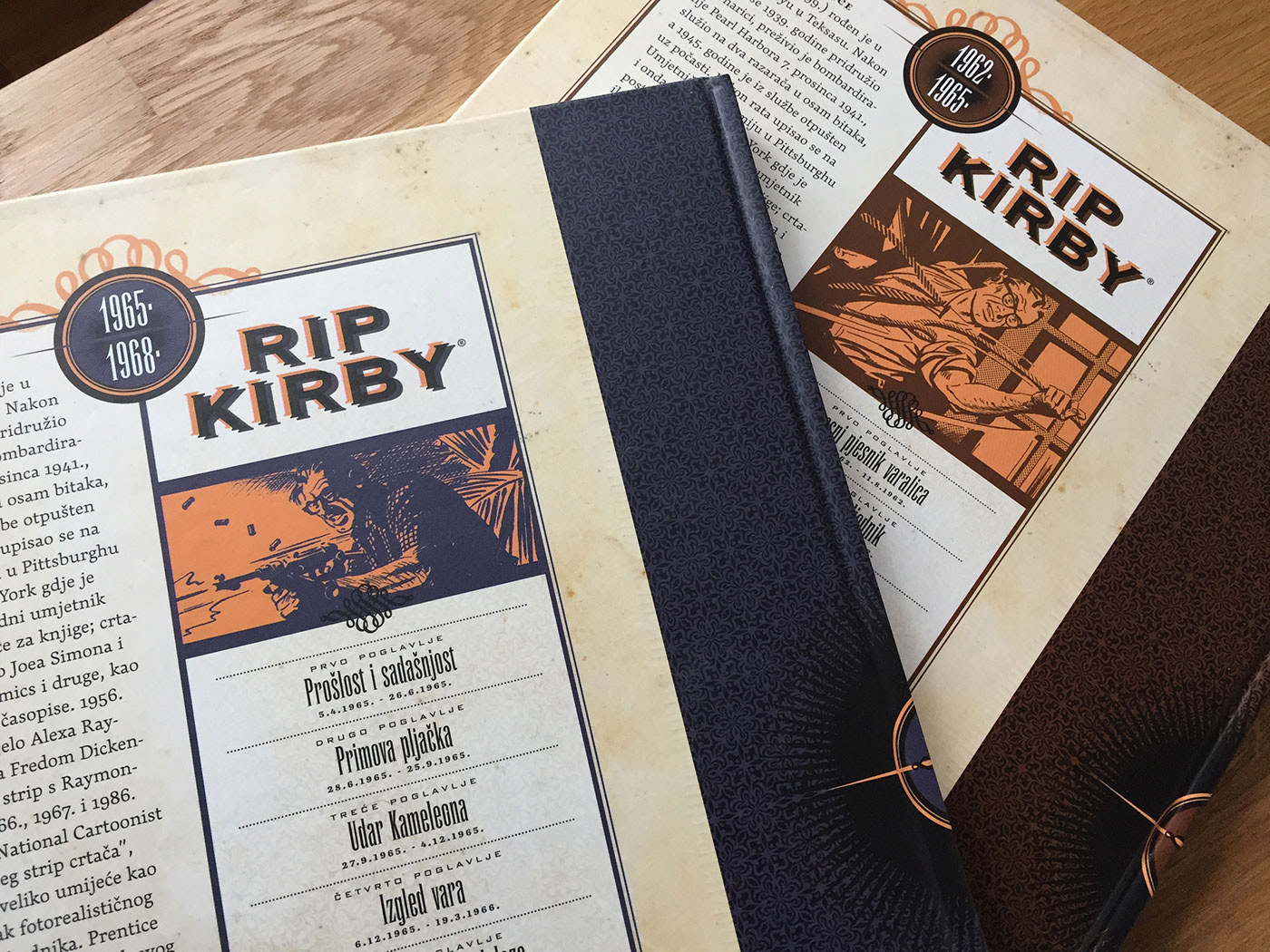
Interior is designed with some details and ornaments with the intention to look like old typesetting.